
Nina Tran Shares A Few of Her Favorite Things
Posted by Sarah @ PIA on Jan 26th 2023

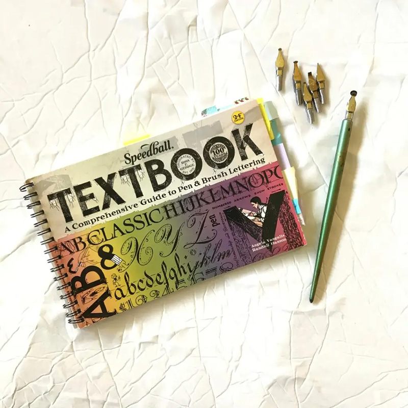
Hey, guys! Nina Tran (@anintran) from Los Angeles, CA here. The first thing I want to share: Speedball lettering nibs! Have you seen some of these before? Randy Hasson blew my mind at the 70th IAMPETH @iampethofficial conference this year at his lecture on the history of Speedball and in his "Writing with a Bent Nib" class.
The supply list alone for Randy's class was intriguing enough to get me to sign up! I just had to know what a "bent nib" was and how to use one. Sometimes we need to take a class that pulls us out of our comfort zone and gently guides us into the unknown — which in this case was the Speedball bent nib series for me.


Nibs used: A-1, A-3, B-3, C-1, C-3, C-5, D-1 Ink used: Norton’s Walnut, Fox and Quills: Peacock, Flamingo, Muir Woods Paper: Borden & Riley Boris Layout
I learned so much from Randy that week and have been itching to peruse through my Speedball Textbook (24th Edition) to learn more lettering with my new collection of Speedball Nibs. The Bent Nib series includes: A (square), B (Round), and D (Oval). The Speedball C-series nibs are not bent but are cut right oblique for broad nib calligraphy such as Italic, Pointed Gothic, Foundational, etc. I learned how to “test drive” a Speedball C nib in Todd Jameson’s class a couple of years ago, and it’s been my go-to broad nibs for Gothicized Italic, Fraktur, and Uncial ever since. The Speedball Textbook recommends the C-5 nib for one of my favorite lettering styles: Stunt Roman. Oh, the possibilities
The next topic: It's not you, it's your nib!
No, really, it could be your nib! A common cause of frustrated-calligrapher-itis (yup, it's a thing) is the nib! Often times the problem is that it needs to be prepped (that is, we need to remove the protective coating or natural oils from our fingers from all the handling off the nib before dipping it ink) or replaced (with use, the tines on our nib become damaged and/or lose resilience).

Nib: Hunt 101 Inks used: Iron Throne by @foxandquills
Prep your nib if:
It's a new nib and you're experiencing ink flow problems or ink blobbing, try prepping it a few times until your ink coats your nib evenly. You can use all sorts of things to prep your nib including rubbing alcohol, toothpaste, surface cleaners, and even good ol' saliva (preferably your own! #justsayin). For class, I carry around a small container of Windex; at home, I moisten a small corner of a clean paper towel with my saliva (it's not gross as it sounds #brushyourteethfirst).
Replace your nib if:
It's a used nib and the ink just won't flow down the slit. It's possible that your nib is worn out and the tines just won't snap back together as tightly or have lost resilience and flex too readily upon contact with the paper -- which can affect ink flow. You're experiencing scratchy upstrokes and unpredictable ink splatters, it may be time to retire that nib and grab a fresh one from your stash. Your tines are permanently open, even when you're not applying pressure. Definitely time for a new one!

Nib: Hunt 101 Inks used: Iron Throne by @foxandquills
The thing is, pointed pens don't last forever -- especially when we use them regularly. The lifespan of your nib depends on many factors: how often you use it and for how long, how much pressure you apply for your shaded strokes, what ink you're using, and what paper you're using. On average, I go through about one Hunt 101 nib every 1-2 weeks, depending on all the factors I mentioned. It's always a good idea to keep a few extra nibs in your stash.

Nib: Hunt 101
- Top nib is a new nib that has not been prepped. Notice how the ink doesn’t coat the nib evenly.
- Ink will coat a prepped nib more evenly.
- Notice the slight worn tines.
- A pointed nib with a permanent gap (however wide) is a goner.
A new, well-prepped nib can make all the difference! What’s your method for prepping nibs and how long does one nib usually last you?
Now, let’s add a bit of color to our work. I looooove Norton's Walnut ink. Sometimes, a full sheet of brown letters can use a little somethin'-somethin' though. Let’s try pairing our walnut ink practice with a colored ink like mint, gold, pink, turquoise, or orange to make our letters pop a bit. You can use the color to highlight certain letters or words, or both. Here I'm using one of my favorites inks: Fushimi Inari by Fox and Quills. Perfect for the Fall/Thanksgiving theme of this month.

Nib: Hunt 101 Penholder by Yoke Company @yokepencompany and Garage Woodworking Ink: Tom Norton's Walnut ink and Fox and Quills
Tip 1: If you have 2 penholders and 2 nibs, designate one penholder for one color so that you don't have to keep cleaning off your nib between color changes.
Tip 2: To avoid accidentally cross-contaminating your ink wells, try to keep your ink wells and penholders separated and double check that you're dipping the right pen into the right
As a newbie in the world of broad pen calligraphy, the Pilot Parallel Pen and I have become fast friends -- best friends, even! Here are my top 3 reasons for loving the Parallel Pen:
- Cartridges! Yup, this bad boy takes ink cartridges -- that means, no dipping or loading ink onto the nib. These pens allow me to focus my energy on learning my strokes and letter forms without having to fiddle with the nib and ink #superbeginnerfriendly. Don't get me wrong; I still love my Speedball C nibs.
- Did I mention you can reload empty cartridges yourself?! Although the cartridges come in an array of colors (my faves are the light green and turquoise) you can fill an empty cartridge with any dye-based inks from your ink stash. I've even been told that you can load ink into the barrel directly without a cartridge.
- Portable and indestructible. Ok, ok. Maybe not totally indestructible, but if they can withstand the handling of my curious 7-year-old son, they're pretty much indestructible.
The Pilot Parallel Pens come in 4 different sizes:
- Red: 1.5 mm
- Orange: 2.4mm
- Green: 3.8 mm (what I'm using now)
- Blue: 6mm
- UPDATE: The Pilot Parallel Pen is now available in additional sizes/colors.
Jake Rainis @jakerainis has a great blog post titled Pilot Parallel Hacking: The Unofficial Parallel Owner’s Guide. Thanks, Jake. Thanks also to @jelvin, @sachinspiration and @carligraphy for their constant inspiration. Oh! As for the washi tape: it's easy to lose your pen when you're in room full of other Parallel Pen owners. Washi tape comes in handy for marking your belongings or labeling what color cartridge you have inside.
Let's get our broad nib on!
Finally, I'm sharing a handful of my favorite books from my bookshelf:

The Zanerian Manual is a must-have for those studying Engrosser's Script or Copperplate. You can find a free PDF version of this book for your personal use on David Grimes's website (thanks, David). Dr. Vitolo @drjmvitolo has his free, interactive e-book available on his website too -- another excellent resource for Engrosser's Script/Copperplate. (UPDATE: This book is unfortunately now discontinued. No print copies are available, but the above PDF is still available.)

The Speedball Textbook (24th edition) is one of my favorite books. Though I had originally purchased it as a Copperplate script reference, I soon discovered the plethora of scripts and lettering exemplars in this book! I've opened this book a million times and I feel like I'm *still* finding new things all the time -- especially after taking Randy Hasson's class in July. (UPDATE: A new 25th edition of the Speedball Textbook is now available. Linked above.)

F.W. Tamblyn's Home Instructor in Penmanship by Frederick W. Tamblyn has lessons in Business Penmanship, Ornamental Penmanship, a bit on Engrosser's Script, Offhand Flourishing as well as lettering and engrossing.

A great resource for broad nib newbies like me is Sheila Waters's Foundations of Calligraphy. This book as great and clear instructions and illustrations. I love her attention to the little details. The deeper I dive into the world of the broad nib, the more valuable this book becomes to me.
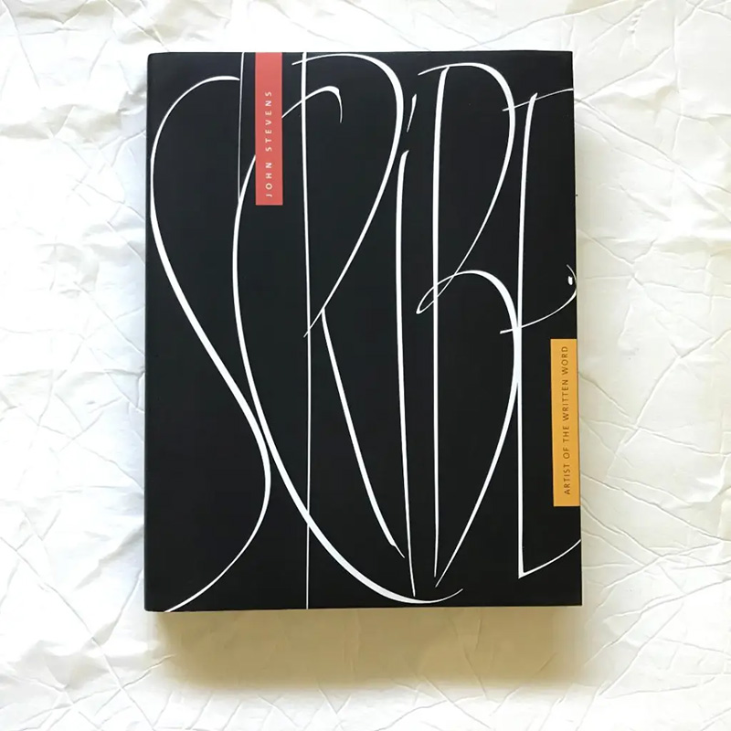
Scribe by John Stevens is a book that I open when I want to feel inspired by images and words. I love his attitude on learning and practicing, and adding exploration and experimentation into the mix. I’m often both drooling over his work while meditating on his wise words. #totallypossible
There are so many calligraphy and lettering books out there. I don't own very many, but these are my top 5 physical books from my bookshelf. I love the New Standard Practical Penmanship by the Spencer Authors and the Lessons in Ornamental Penmanship by Z.P. Zaner -- both of which can be found on the IAMPETH website.
What are some of your favorite calligraphy and lettering books?

You can follow Nina Tran on Instagram at @anintran.
For more pictures of her work, upcoming calligraphy workshops, guide sheets, demos, and more, visit Tran's website.