
Pencil Lettering and Illuminated Letters with Evelyn Wong
Posted by Sarah @ PIA on Feb 16th 2023
Hi everyone! I’m Evelyn Wong (@inkdropletcreations) from Hong Kong here. A little introduction about myself––I’m a Solicitor (lawyer) who’s always loved anything to do with arts & crafts. So the year before I got married, Jovy, a best friend of mine, introduced me to a calligraphy workshop so that I could design my own invitations and place cards. Once I picked up that holder, I was hooked! I took whatever workshops were available to broaden my knowledge, with the latest being illuminated letters. What I love about calligraphy is that it allows me to reconnect with my creativity, and is extremely therapeutic. If I had to choose my favourite hand, I would have to say it’s Spencerian script and of course, Illuminated Letters (who could resist that shiny gold leaf?).
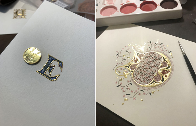
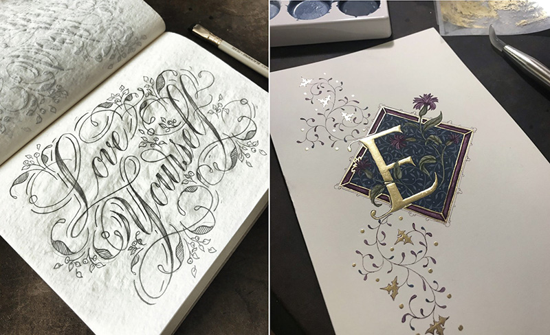
So throughout this article, I will be posting some photos, videos and tips/ advice on (i) Pencil Calligraphy and (ii) Gilding. I hope you’ll enjoy them and will be able to get some helpful tips/ inspiration from them. To give you an idea here are a few of my Pencil Calligraphy and Illuminated Letter pieces. How did your calligraphy journey start and what inspires you? I'd love to hear all about it!
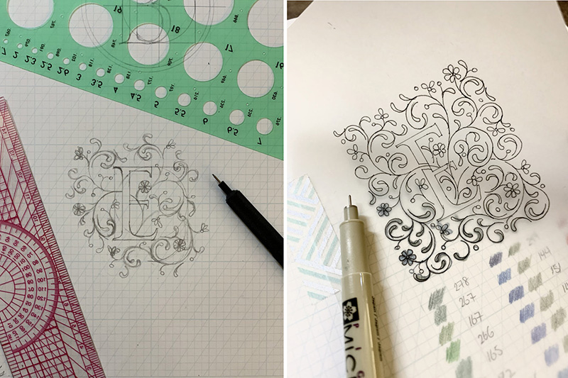
Let’s have a look at writing calligraphy with a pencil. In 2017 I took a workshop on Open Shaded Script with the amazing Anne Elser where she opened my eyes to a different style of calligraphy. From there I added my own twist and moved from pen to pencil. This was perfect especially for the times when I didn't have a dip pen and ink with me; I could just easily doodle while out and about.
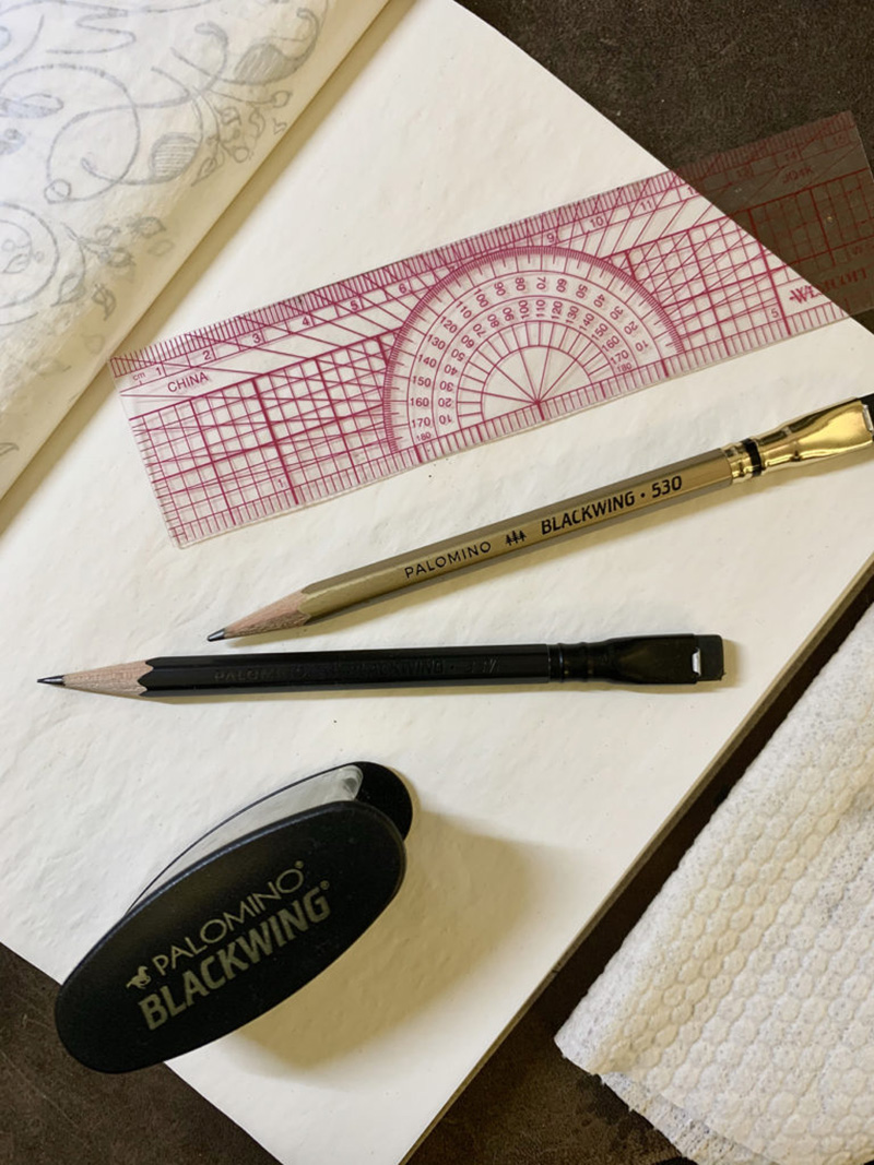
When doing these pieces, I tend to prefer using Blackwing extra-firm/ firm graphite pencils. Not only do they run as smooth as butter on paper, but they can produce crisp clean lines at the same time. They are an absolute dream to write with. But of course, any other pencil will do too! It’s all a matter of preference (& just to clarify, these posts are in no way sponsored). So, back to writing calligraphy with a pencil. You should definitely give it a try as there’s something so soothing and raw about the process and texture of pencil calligraphy, which I love.
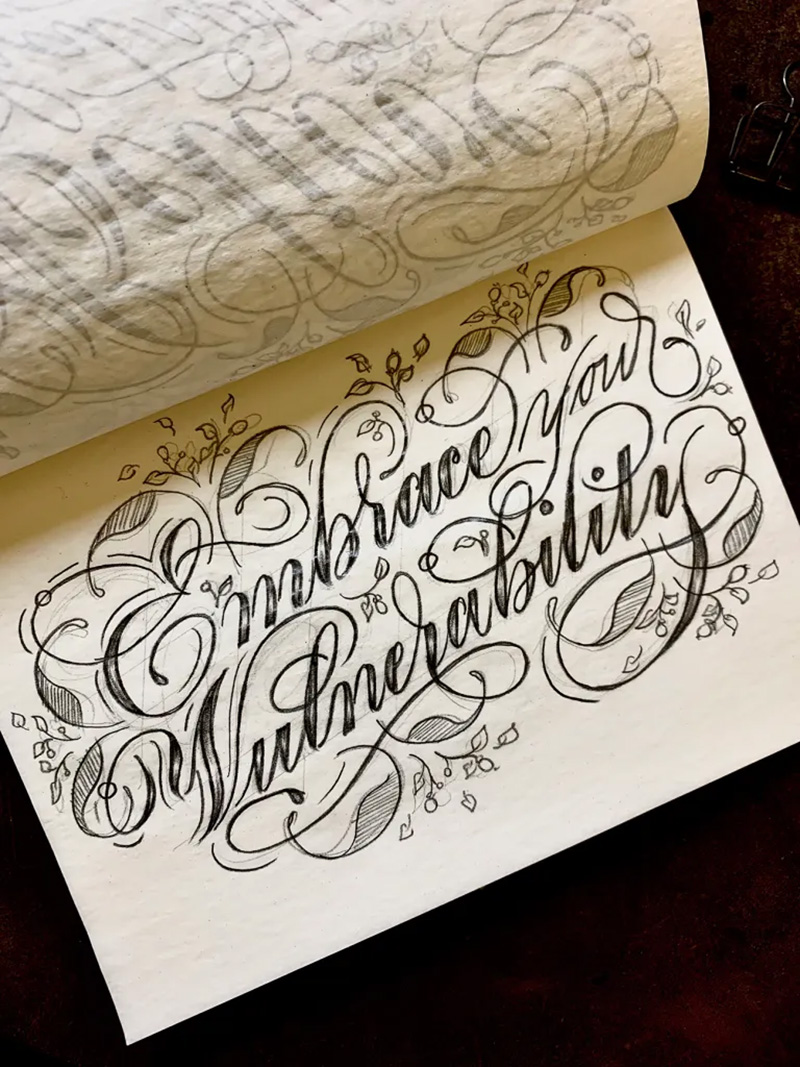
I tend to use this script when I want to write 1-4 words, or else it might seem a bit over-crowded. Start off by drawing a very light guideline, just to make sure that the x-height of the lowercase are consistent, and from there I would lightly sketch out the words to make sure the format and spacing is correct before adding more pressure. The scripts I base my Pencil Calligraphy on are Copperplate/ Engrossers for the lowercase, and for the uppercase I can draw inspiration from Spencerian, Italian Hand or anything which a bit more of a flourish. Once I have got the word written out, I then take a step back, look at the negative space, and think of ways to balance out the flourishing in the existing word.
Have fun experimenting with different swirls, curls and twirls! You might be happy with what you have already, or you can go ahead and add some leaves, flowers and buds. Experiment, look for inspiration and make it uniquely yours. I do try not to use an eraser for these, as it adds a touch of rawness to these Pencil Calligraphy pieces. It also reminds us that sometimes, it’s okay to just have fun and enjoy what you do without having to worry that everything has to be perfect. At the end of the day, do what screams ‘you’. If you prefer writing with a pen or experimenting with a different script, I’d say go for it! Because you’ll be surprised with where experimentation leads you, and the joy it brings finding your own style.
Pencil: Blackwing Ruler: Westcott 6 inch Ruler
I hope you've been having fun scribbling away with your pencils. Next, we will be looking at the process for gilding! I've been very fortunate to take workshops with @rosemary_buczek and @toniwattsart and also @masterpenman's online workshop a few years back. There's so many ways and methods to do this, so I would advise you all to join as many workshops as possible, learn the techniques from each of these amazing calligraphers/ artists, and take away which method works for you.
To start off, there's a number of references and books you can read to learn about gilding, or just to get inspiration from when drawing your designs. Here are a few of my favorites:
The Bible of Illuminated Letters by Margaret Morgan
Writing & Illuminating & Lettering by Edward Johnston
The Macclesfield Alphabet Book by Christopher De Hamel
There are so many great resources out there, and definitely have a look through @iampethofficial's website. Feel free to let me know which ones are your favorite too!
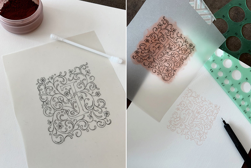
I always start off by sketching out my designs on the PIA Copperplate Practice Pad. Then I trace the design on tracing paper with a Sakura Pigma Micron .05 pen. This is so I can keep the design, in case I ever want to re-trace it. I then rub the back of the tracing paper with some Gilders Bole Powder, before tracing it on hot press watercolor paper. The reason I used Gilders Bole Powder is because it is water soluble, so you won't see the lines after gilding or painting on top of it. Have fun with coming up with a design, and next we'll be going through how to layer on the Instacoll.
Now that you have your design traced out, we can start applying the gold size. For this piece, I will be using Instacoll as the gold size. You can use gesso as well, it's just that the gesso I have contains lead, so it's best that I avoid using that whilst the baby is around as it is slightly poisonous. And again, it's not necessarily that one is better than the other, it all comes down to a matter of preference. It's important to mix the Instacoll thoroughly before decanting a small amount to be used. I tend to only take out what I might need as it dries up quite fast, and a few drops will go quite a long way. Dilute the Instacoll to a consistency you prefer. You really have to experiment and test which consistency works the best for you, as there are so many factors to take into account (i.e. the humidity of where you're living, whether you want to create a flat gilding piece or a raised gilded piece, etc.). For me, I prefer it when the consistency is diluted to a point where it forms a small bead at the tip of your paintbrush (i.e. adding 20% distilled water to the Instacoll).
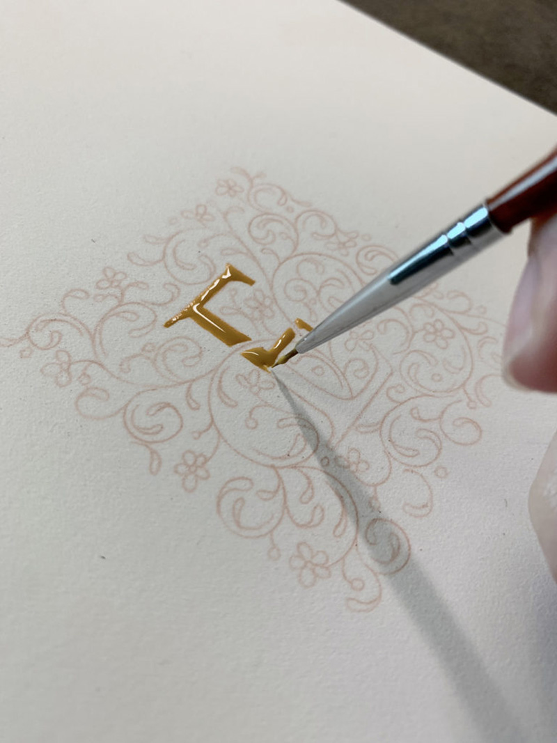
Once you have got the consistency you prefer, start by applying a drop on a corner of your piece and "float" the Instacoll by gently dragging that drop towards the rest of your letter. When you notice that the Instacoll is about to thin out, get another drop and put it on the wet Instacoll and repeat the floating action. By floating the Instacoll instead of brushing it on, it will give you a smooth finish. Once the gilded area is covered, put it aside to dry, and again depending on the humidity of where you are, the time for drying will vary. Next we will look at applying gold leaf and painting it with gouache. Tip: If you want to make small little gilded dots, I tend to use a Ball stylus to make the little dots as this will help with the consistency of the size of the dots.
I prefer using loose gold leaf for gilding. So what I do is cut out a piece of acetate and gently place it onto the gold leaf, and the static on the acetate is what makes the loose gold leaf stick. Make sure your windows and air-conditioners are closed/off before doing this, and probably hold your breath for a few seconds. Once the gold leaf is stuck on, you're ready to go!
Before applying the gold leaf, you need to reactivate the Instacoll by breathing on it, as the moisture in your breath will make it a bit more damp allowing the gold leaf to stick on easily. Place your piece of acetate with the gold leaf onto the Instacoll and using a Dogtooth Agate burnisher, gently rub/ press the gold into place. Breathe and layer on more gold to the areas where the gold leaf didn't stick to. Once that's done, using a Gilders Mop (or a brush with very soft bristles), gently brush off the excess gold. You can further burnish it by placing a sheet of glassine paper onto the gilded piece and gently rubbing it with the Dogtooth Agate burnisher, or even burnishing directly on the gold.
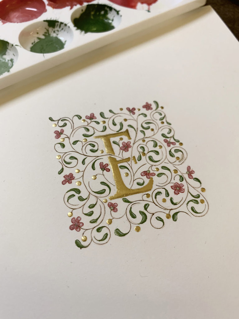
Next comes painting the letter. I usually use gouache to paint the letters, starting off with the light tones, moving to to mid tones then dark tones before touching it up with a bit of highlights using @winsorandnewton titanium white gouache. The last step is to outline everything. And there you have it! Your piece is complete. Just remember, sometimes your piece might not end up like how you imagined. Like this one here: I feel like I went overboard with the flourishing. I was considering making another piece as a sample for all of you, but thought, Hey! We all need to know that people can make mistakes and sometimes the designs don't necessarily work out. So my takeaway here is take each piece as a learning process, and don't be too disheartened if it doesn't work out the first time. I can't emphasize enough for you to enjoy the process and through more practice we're bound to improve. I can't wait to see what everyone comes up with!
You can follow Evelyn Wong on Instagram @inkdropletcreations.
Find Blackwing pencils here and gilding supplies here to begin your pencil calligraphy and illuminated letter journey.