
Nib Notes with Schin Loong
Posted by Sarah @ PIA on Jan 19th 2023
Hi everyone, this is @openinkstand! Throughout this post, I will be showcasing 6 pointed pen nibs, all of which are available from @paperandinkarts. First, a little introduction. My name is Schin and I live in Las Vegas. I am a graphic designer and illustrator, and I try to incorporate an artistic and playful side to my calligraphy and lettering style. I maintain a Youtube Channel, a Blog, and last year I published a book on pictorial flourishing called Calligraphic Drawing (available at @paperandinkarts). I teach workshops on Spencerian, Madarasz script, floral envelope painting, and of course, calligraphic drawing. My hobbies include playing with my dog Wuffles, practicing piano, yoga, and collecting pointed pen nibs. God I have so many nibs.
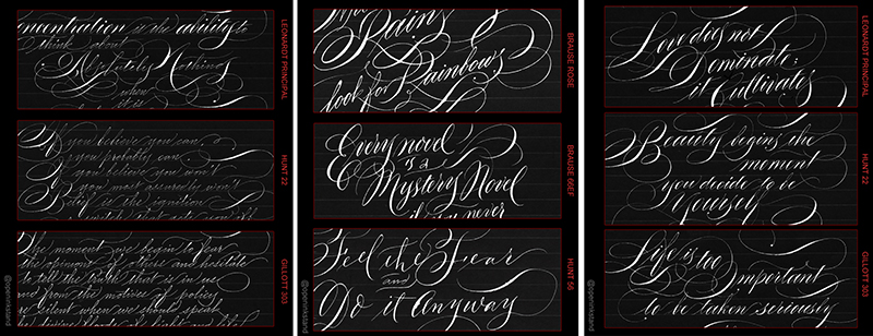
I thought I’d start today with one of my favorite nibs, the Leonardt Principal. Based on the legendary vintage Gillott Principality nib, these are still my favorite work horses. It’s a little expensive, but so indispensable to my work that I buy them by the gross. It is very flexible, yet keeps a wonderful sharp and consistent line. These are great for everything, from precision scripts such as Engrossers and Ornamental Penmanship (where you really need the thicks and thins to be as accurate and neat as possible) to big and bold writing.
However, these aren’t really beginner friendly, and you might find snagging to be an issue. If that happens, I find writing on a lower angle (closer to the paper) to be helpful. If it starts snagging too much though, just replace the nib. Once a nib gets old, it gets sharper, snags more and the point gets a little thicker. So despite the great quality, these don’t last as long as I like and I go through them pretty much like water. That’s why I buy them in bulk!
If you look below, you’ll find some art I made using this nib. Most of my best writing and drawings are made using the Principal, and wherever I go, I make sure to always have a few new ones on hand.

The next nib is another favorite, the wonderful Brause Rose. It is one of the most flexible nibs I know, so it is fantastic for lettering styles that needs dramatic juicy swells, such as the Madarasz script I use. It is so incredibly flexible that sometimes I actually use it more like a brush than a nib for a really bold, dramatic look! You really have to load it with a lot of ink and really go to town with this fella. And boy do I go to town. Just make sure paper towels are handy!
One downside with the Rose is it can be a bit of a drama queen. It has a tendency to skip (you can see that happening in the video) and can be notoriously difficult to start. I demoed some solutions to these problems in one of my Youtube videos, but just like anything else, it’s a matter of practice. Another downside is the cost; it is one of the more expensive nibs for sale. However, my Rose nibs last forever because as they wear down, the point gets a little thicker but remains perfectly serviceable due to its great quality. NBD. I just don’t find myself reaching for a new Brause Rose as much as I do for other more delicate nibs. I wouldn’t use it for thin, delicate work like Engrossers or Ornamental Penmanship though … it’s much too extroverted for stuff like that.
If you look below, you’ll find some art I’ve done with the Rose. All pretty big and bold lettering! The Cersei Lannister portrait is actually done with a combination of nibs, but the thick patterns on her sleeves and shadows in her hair and neck are done with the Brause Rose. It adds so much texture!


TIPS TO PREVENT YOUR NIBS SNAGGING:
- Make sure you’re not using cheap or porous paper. Good quality paper prevents 70% of snags!
- Try holding your penholder at a lower angle (closer to the paper)
- Make sure to use a light touch when you are writing; don’t grip too hard!
- Make sure your nib is clean and new. Dirty and old nibs tend to snag much more.
- Always check your nibs before writing. Make sure the tines aren’t sprung!
Next I’m showcasing the tiny little Brause nib, the Extra Fine 66. This nib may be small but boy it packs a punch! It's not as crazy flexible as the Brause Rose (I mean it CAN be but if you flex that much it’ll ruin the tines!) but it is just so bouncy and happy. A lot of nibs are flexible, sure, but this one really dances along with you. It creates very smooth and consistent lines, and I think of it as the Rose's smaller, spunkier little sister. If your calligraphic style calls for modern bouncy lettering, then I think you will really like this guy. I think it’s easier to ‘start’ than the Brause Rose too.
It’s a tiny nib though. You might not be able to fit these in your regular penholders, so you will have to either adjust your flange using a pair of pliers or buy a specific penholder. Another thing to keep in mind is these can spring easily. Springing a nib means to apply so much pressure that the metal loses its memory and the tines get bent out of shape. Happens all the time, especially with small nibs (it’s hard to resist pushing the envelope!), but when it does happen, the nib is done for. Don’t even try to fix it, just throw it away and get a fresh one.
If you look below you’ll see some art I’ve done with the Brause 66. The one with the horse was done for an event at the Art Institute of Chicago, and the Swan envelope was done for an exchange at @flourishforum. This little nib can do it all!


Next, I’m showcasing the Hunt 56. Okay, I'll be honest; I'm not the biggest fan of this nib. But it's a workhorse. Not one of those big pretty workhorses with the fluffy hooves (that would be the pretty gold Zebra G nib); this is more like a ... plainer looking workhorse. It is rather stiff, kinda-sorta flexible, and not the smoothest, but because it is a school pen (meant for schoolchildren to use), it is cheap, very friendly, won't snag, and will work for any drama-free basic lettering and drawing. I recommend these for drills, since you just need to dip once in ink then zoom through your drills without worrying about snagging or whatever. Pretty basic nib that does what you need, just don’t expect too much accuracy, flexibility or frills.
If you're a beginner and on a budget, this will work great. I also recommend adding a few Nikko G and Zebra nibs to your cart, those are comparable to the Hunt 56, are very popular, and work just as well if not better! If you look below you’ll see three examples of art I’ve done with the Hunt 56. It works for simple plain lettering, and I also used it for these floral invitations. The portrait of the woman was also done using watercolor, and I wanted to interlace some quotes around her. If I used a sharp nib (such as the Principal or Gillott 303) then it would have snagged on the soft watercolor paper, but the Hunt 56 (or Zebra/Nikko G) glides on just fine, drama-free.


TIPS FOR LONGER LASTING NIBS:
- Make sure you are always cleaning your nib; NEVER let ink or water dry on it!
- Use a non-corrosive ink. Acidic inks (such as iron gall) will literally corrode and eat away your nibs.
- Never apply too much pressure on your nibs; once you ‘spring’ the tines, it is a goner.
- Never touch or fiddle the tip of your nib with your fingers.
- Store your unused nibs in a cool dry space.
Next I am showing you the underrated vintage Hunt 22. This very serviceable nib actually compares to a Leonardt Principal, though the drawback is it’s just not as nice. If you look below you’ll see some art I’ve done with the Hunt 22, including some Ornamental Penmanship. The lines are so fine and thin that I think it outperforms the Principal in that respect! It was just so pleasurable to write with and it just glides right along. I don’t think these nibs last as long (it’s made of a thinner material) so you might need to replace it more frequently, but if you can afford it and need something snappy and flexy, then give the 22 a try! Let me know what you think!


Next I want to talk about the Gillott 303. Ok ok ok, I know these little blue nibs don’t have the best reputation. You might have heard some horror stories. It used to be these nibs were so notoriously awful that I would rather stab myself in the eye than use them. But recently, I guess someone at quality control switched from decaf to espresso, and boy this nib has gotten a makeover! I bought a few from @paperandinkarts earlier this year and the quality has gotten a whoooole lot better, snagging has decreased, and best of all, they're very affordable. I know you don’t believe me, but really, get a few and try it out for yourself. You might have a new cheap favorite!
A little side note … if you happen to find a place that is selling you cheap brown or copper colored Gillott 303s (rather than blue), buy the whole lot! That means you’ve found the original vintage Gillott 303s, which are such amazingly superior but unfortunately no longer made nibs. Completely different from these blue remakes we have today. Send me some.


I hope these videos and pictures has been useful to you, and I’m honored to be able to share my thoughts and findings. I have more modern and vintage nib reviews on my Youtube channel, and of course, if you have any questions feel free to DM me at @openinkstand and I’m always happy to chat about nibs and calligraphy. Schin out!
Here are some useful charts that illustrate the differences between the aforementioned nibs:
Videos have not been sped up, except for the flourishing at the end of the Brause EF66 videos. Some pauses has been edited out (I’m usually adding ink or cleaning the nib off-camera during these pauses).
Ink: Sumi ink for black, Dr. PH Martin’s for white.
Paper: Rhodia and some simple black cardstock I found
You can follow Schin Loong on Instagram at @openinkstand
For more photos of Loong's work, calligraphy services, and upcoming classes, visit her website.